Opening the Trade Summary Matrix Chart
1. Select the preferred counter.
3. Click on the  icon at the bottom tab.
Explanation
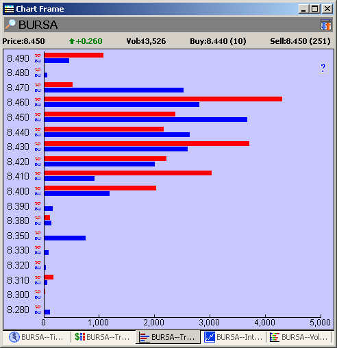
1. The Trade Summary Matrix chart is a graphical representation of the Trade Summary
Matrix.
2. At each traded price, there are two bars. The red bar represents the sell down volume
while the blue bar represents the buy up volume.
|
Note:
|
If you see the price without bar(s), it may mean that the trade(s) cannot be classified or there are too few
transactions at that price and the resultant bar is too small to be visible.
|
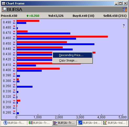
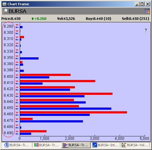
Changing price order
Right click to change the order of the price
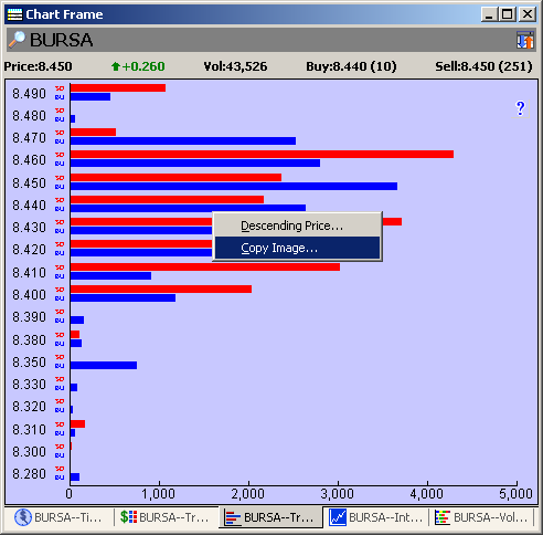
Copy Image to Clipboard
Right click on the image as shown and select Copy Image